Stainless Steel Spoon Logo Readability Inspection for Bulk Orders
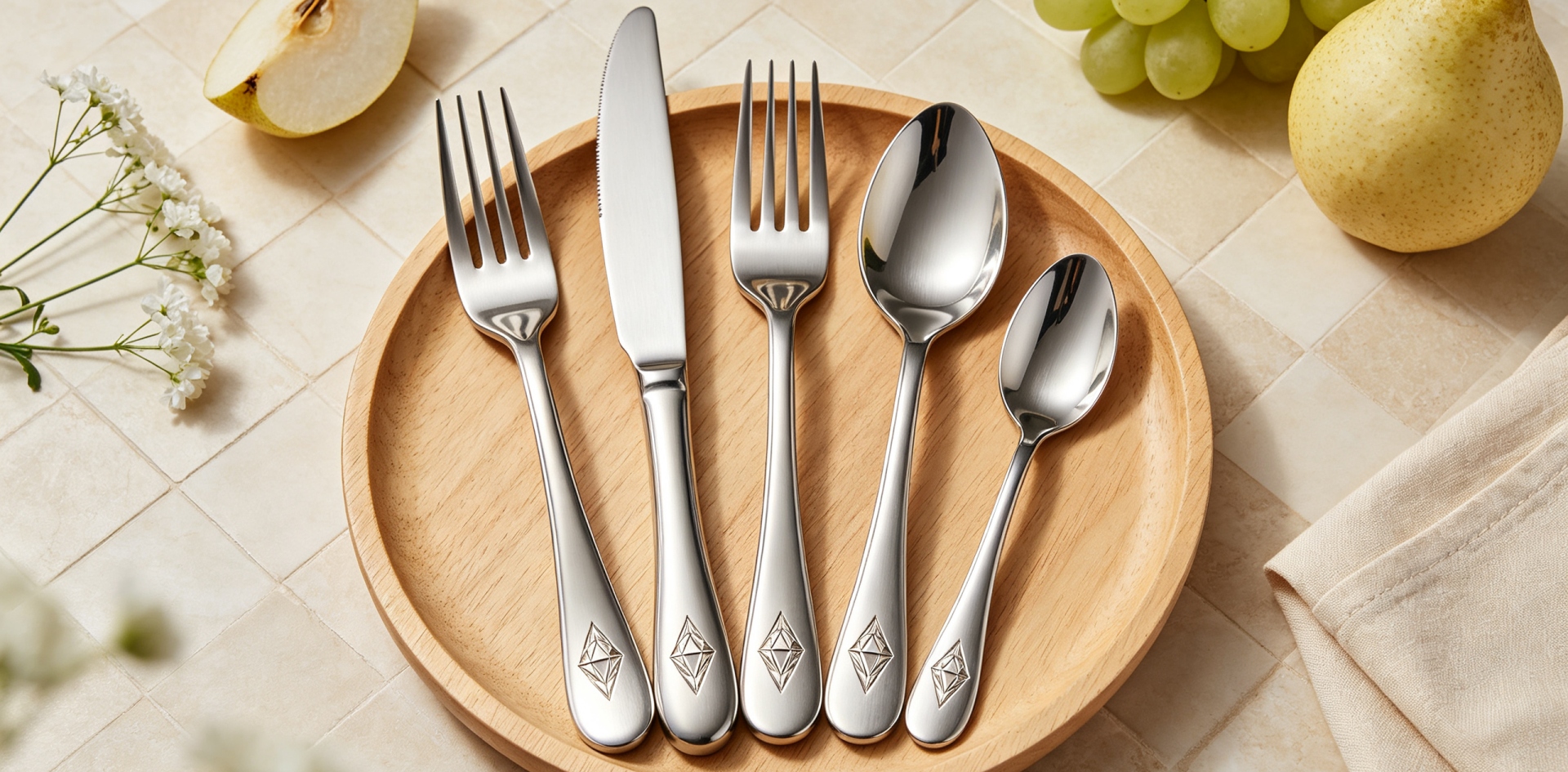
Stainless Steel Spoon Logo Readability Inspection for Bulk Orders
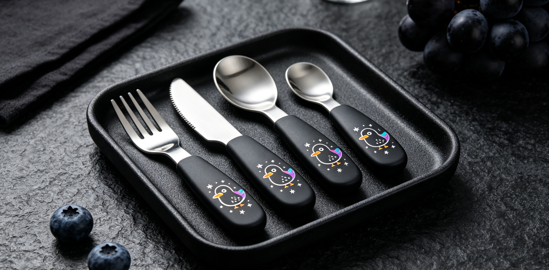
For buyers developing branded stainless steel spoons, a logo is more than a decorative detail. It identifies the product, supports brand recognition, and helps create a consistent appearance across a cutlery collection. However, a logo that looks clear on one approved sample may appear different across hundreds or thousands of finished pieces if marking requirements are not properly defined.
For importers, distributors, retailers, and hospitality suppliers, logo readability should therefore be included in the product approval process. Homefelt helps B2B customers develop stainless steel cutlery programs with customized product details, packaging, and production arrangements suited to their business requirements.
Why Logo Readability Matters in Branded Spoon Orders
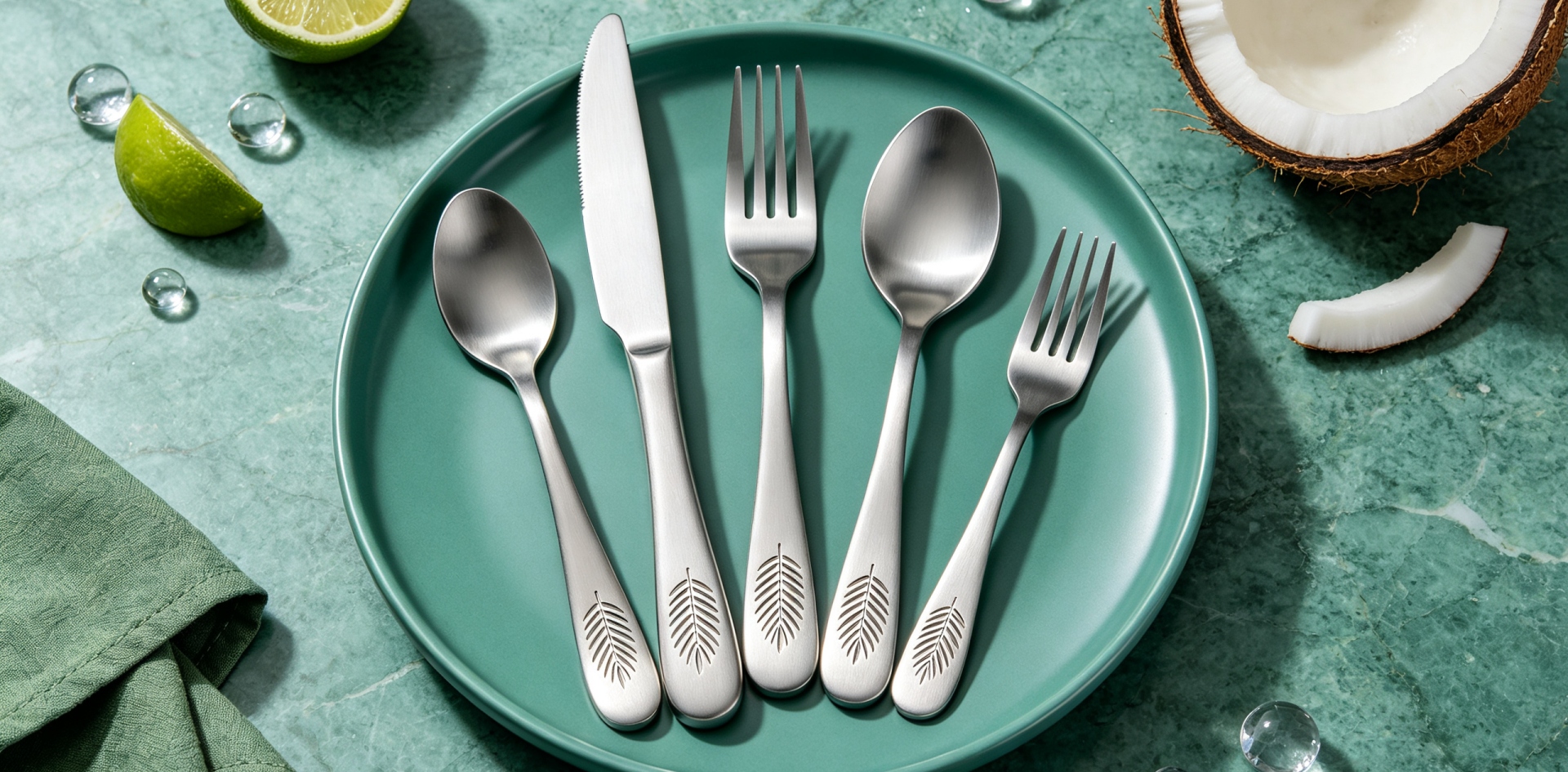
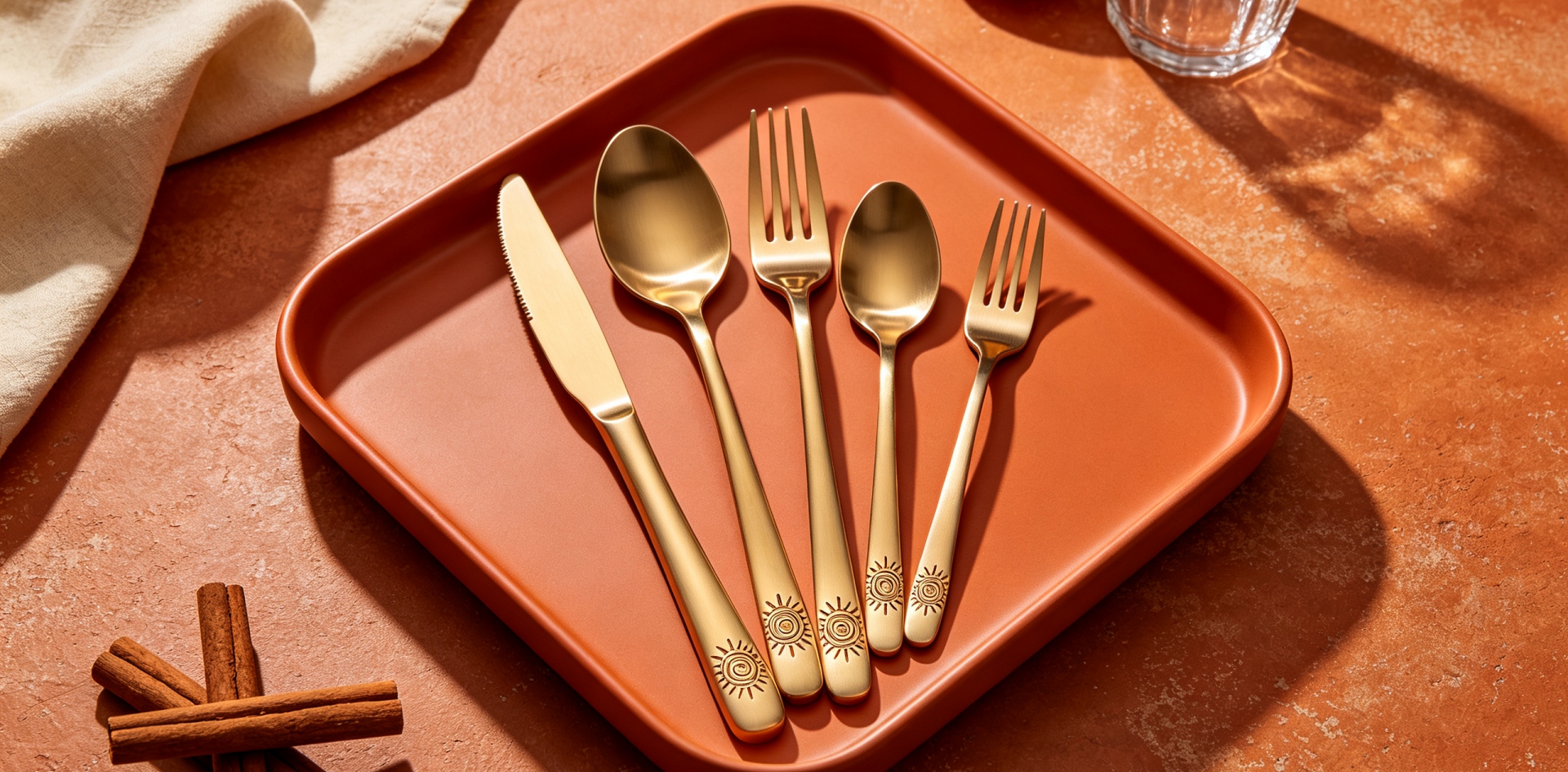
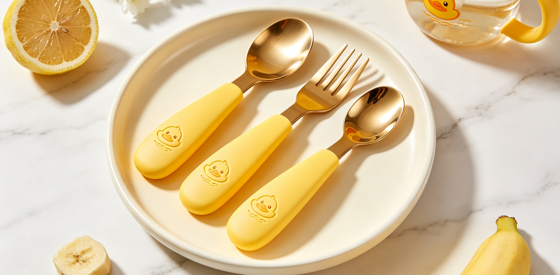
A logo may be applied through laser marking, engraving, stamping, or another suitable marking method. The best option depends on the handle design, available marking area, logo artwork, surface characteristics, and expected appearance.
If lines are too fine, small letters may become difficult to distinguish. If the marking is too deep or visually heavy, the logo may not match the intended design. Decorative handle patterns can also compete with the logo, making it harder to recognize at normal viewing distance.
These details matter when a customer orders a coordinated range of spoons, forks, and knives. Even if each product carries the correct brand name, differences in letter definition, spacing, or visual prominence can make the overall collection appear inconsistent.
Before placing a bulk order, buyers should define what a readable and acceptable logo looks like rather than relying only on a general instruction such as “print the logo clearly.”
Establishing a Practical Logo Inspection Standard
A useful inspection standard begins with the approved artwork and physical sample. The artwork confirms the intended brand identity, while the sample demonstrates how the design appears on the actual spoon handle.
The standard should identify several points:
-
Logo content: Confirm that letters, symbols, and brand spelling match the approved artwork.
-
Character definition: Check that individual letters and fine lines remain distinguishable.
-
Spacing: Review gaps between letters and the overall balance of the logo.
-
Position and orientation: Confirm that the marking follows the approved product drawing.
-
Visual contrast: Check whether the logo can be recognized against the handle surface under ordinary viewing conditions.
-
Surface condition: Inspect the area for unwanted marks, deformation, or damage associated with the marking process.
The acceptable level of detail depends on the logo itself. A simple wordmark may remain readable at a relatively small size, while a detailed emblem with thin lines may require more space or a simplified version.
For this reason, buyers should approve the logo on a representative production sample rather than judging it only from a digital mock-up.
Matching Logo Design to the Spoon Handle
The available marking area is an important design constraint. A narrow handle may not provide enough room for a long brand name, while a curved or decorated handle may limit the usable flat area.
Before confirming the logo specification, buyers should review the handle width, surface shape, marking location, and intended logo dimensions together. A logo that fits within a drawing may still be difficult to read when applied to a small or highly reflective surface.
Artwork preparation also deserves attention. Very thin strokes, tiny text, and closely spaced elements may lose definition during marking. Simplifying unnecessary details can improve legibility without changing the essential identity of the brand.
For coordinated cutlery sets, the same logo may need to be adapted slightly to suit different handle dimensions. Such adjustments should be documented and approved so that the branding remains recognizable across the spoon, fork, and knife.
Inspecting Logo Consistency During Bulk Production
One approved sample does not automatically guarantee identical results throughout a production run. Buyers should establish a clear process for checking the first production pieces and monitoring subsequent output.
A practical inspection sequence includes:
-
Compare the first marked pieces with the approved reference sample and artwork.
-
Verify the spelling, symbol details, orientation, and approximate dimensions.
-
Examine small characters and fine lines at a consistent viewing distance.
-
Check that the logo remains recognizable under normal lighting, without relying exclusively on enlarged photographs.
-
Record any recurring deviations and confirm corrective action before additional quantities proceed.
Inspection frequency can be agreed according to order size, product complexity, marking method, and the buyer's quality requirements. High-volume orders or detailed logos may justify more frequent checks than simple designs on a standard spoon handle.
Photographs can support communication between the buyer and factory, but they should not replace physical sample approval when surface reflection or small marking details are important. Camera exposure, screen brightness, and lighting can make the same logo appear more or less prominent.
Choosing the Right Marking Method
Laser marking, engraving, and stamping can produce different visual effects. The appropriate method depends on the product design and the intended brand presentation.
Laser marking can be suitable for fine graphic details when the equipment settings and surface conditions are appropriate. Engraving may create a more visibly cut mark, while stamping can be suitable for certain handle structures and designs. Each method has limitations, so the result should be evaluated on the actual stainless steel spoon.
Buyers should also consider the handle's surface finish and geometry. A highly reflective surface can make a small logo harder to see from some angles, even when the marking itself is correctly formed. The inspection criteria should therefore focus on practical readability, not simply on whether a mark is present.
Where durability is important, buyers can specify any relevant additional checks based on the product's intended use. The marking method alone should not be treated as proof that a logo will remain unchanged under every cleaning or usage condition.
Connecting Logo Approval With Product Documentation
A clear specification sheet helps prevent misunderstandings between the buyer, designer, and production team. It can include the approved artwork file, logo dimensions, position, orientation, marking method, reference sample, and acceptance criteria.
For repeat orders, retaining the approved artwork and sample reference makes it easier to compare new production with previous deliveries. If the brand updates its logo or the spoon handle design changes, the revised version should be identified and approved before production begins.
Homefelt's B2B cutlery service can support OEM, ODM, wholesale, and private label projects. The factory has experience in stainless steel cutlery manufacturing and can coordinate product design, logo requirements, packaging, and transportation according to the customer's project needs.
Relevant factory audits and certifications can also be discussed when required for supplier qualification. The exact documents available for a project should be confirmed with the supplier, and any product-specific testing or inspection report should be reviewed for its scope and applicability.
What Buyers Should Confirm Before Ordering
Before approving a custom stainless steel spoon with a logo, buyers should confirm the following information:
-
Final logo artwork and file format.
-
Marking method and dimensions.
-
Position and orientation on the handle.
-
Readability criteria for small letters and graphic details.
-
Approved physical sample and reference photographs.
-
First-piece approval and in-production inspection arrangements.
-
Requirements for repeat orders and changes to artwork.
-
Packaging specifications and quantity per carton.
These details help the factory understand the buyer's expectations and allow potential design problems to be addressed before bulk production. They also provide a more objective basis for reviewing finished goods than relying on subjective descriptions such as “good-looking” or “clear enough.”
Work With Homefelt on Custom Stainless Steel Spoons
A successful branded cutlery project combines a suitable product design with clear specifications and reliable quality checks. Logo readability is one manageable part of that process, but it should be considered early enough to avoid unnecessary artwork revisions or production delays.
Homefelt supports stainless steel spoon and flatware projects for importers, wholesalers, distributors, and brand owners. Customers can discuss handle designs, logo marking, material specifications, private label requirements, packaging, and bulk order quantities with the team.
To discuss your project or request a quotation, email ingrid@homefelt.net with your target product, estimated quantity, logo artwork, and any available reference images. Providing these details helps the team assess feasibility and prepare a more relevant proposal.
You May Be Interested In
Stainless Steel Spoon Handle Grip Clearance for Custom Orders
Stainless Steel Spoon Logo Legibility Inspection for Bulk Orders
Related Article